BRIEF
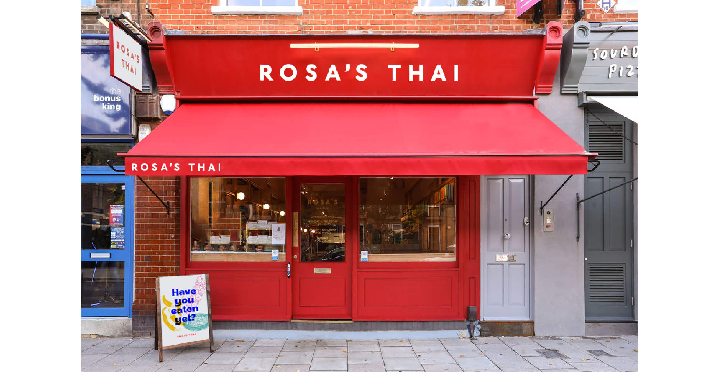
A brand refresh for Britain's most popular Thai chain with roots in authenticity, passionate, food loving people.
THE BRIEF
A brand refresh for Britain's most popular Thai chain with roots in authenticity, passionate, food loving people.
THE BRIEF
A brand refresh for Britain's most popular Thai chain with roots in authenticity, passionate, food loving people.
THE BRIEF
A brand refresh for Britain's most popular Thai chain with roots in authenticity, passionate, food loving people.
APPROACH
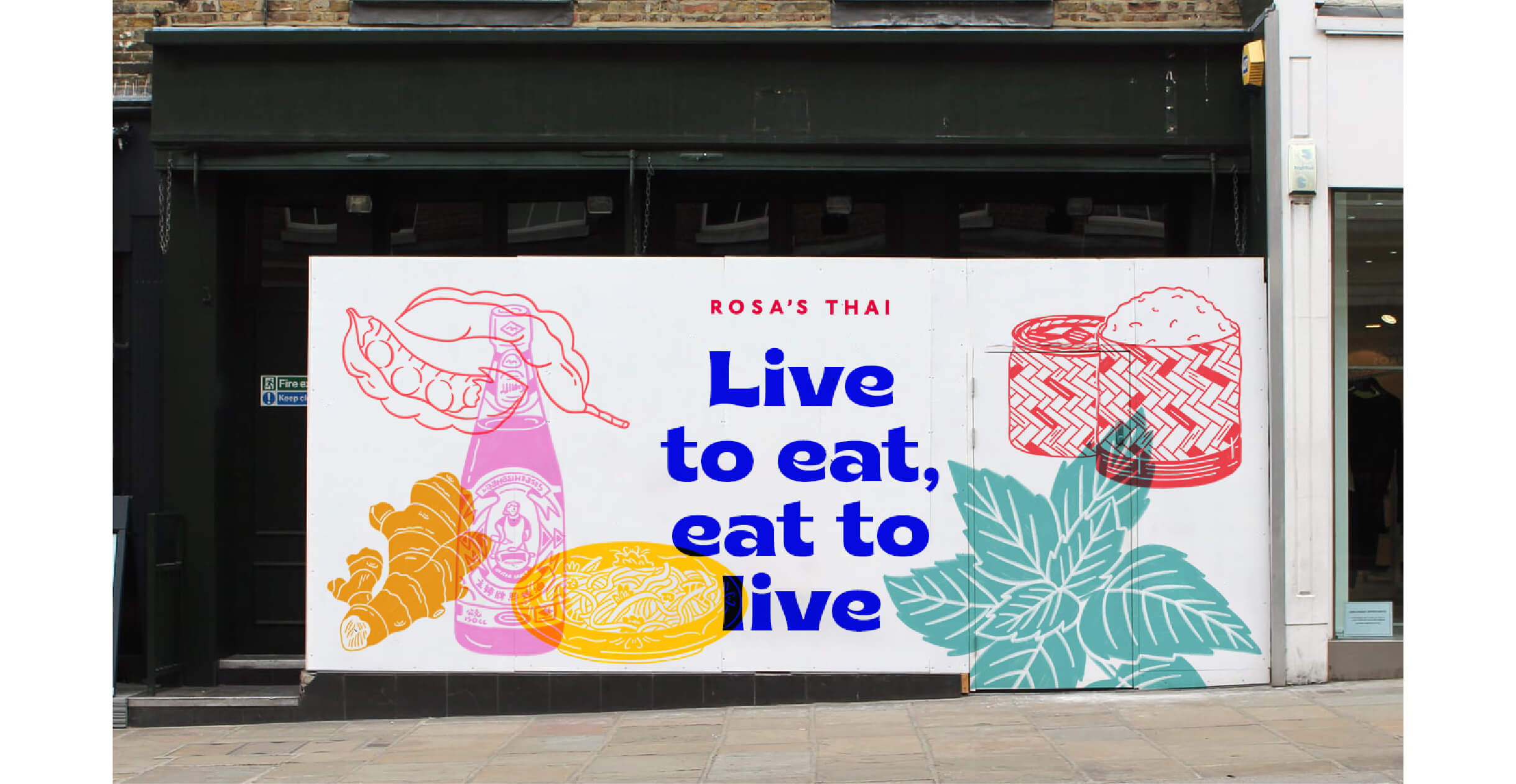
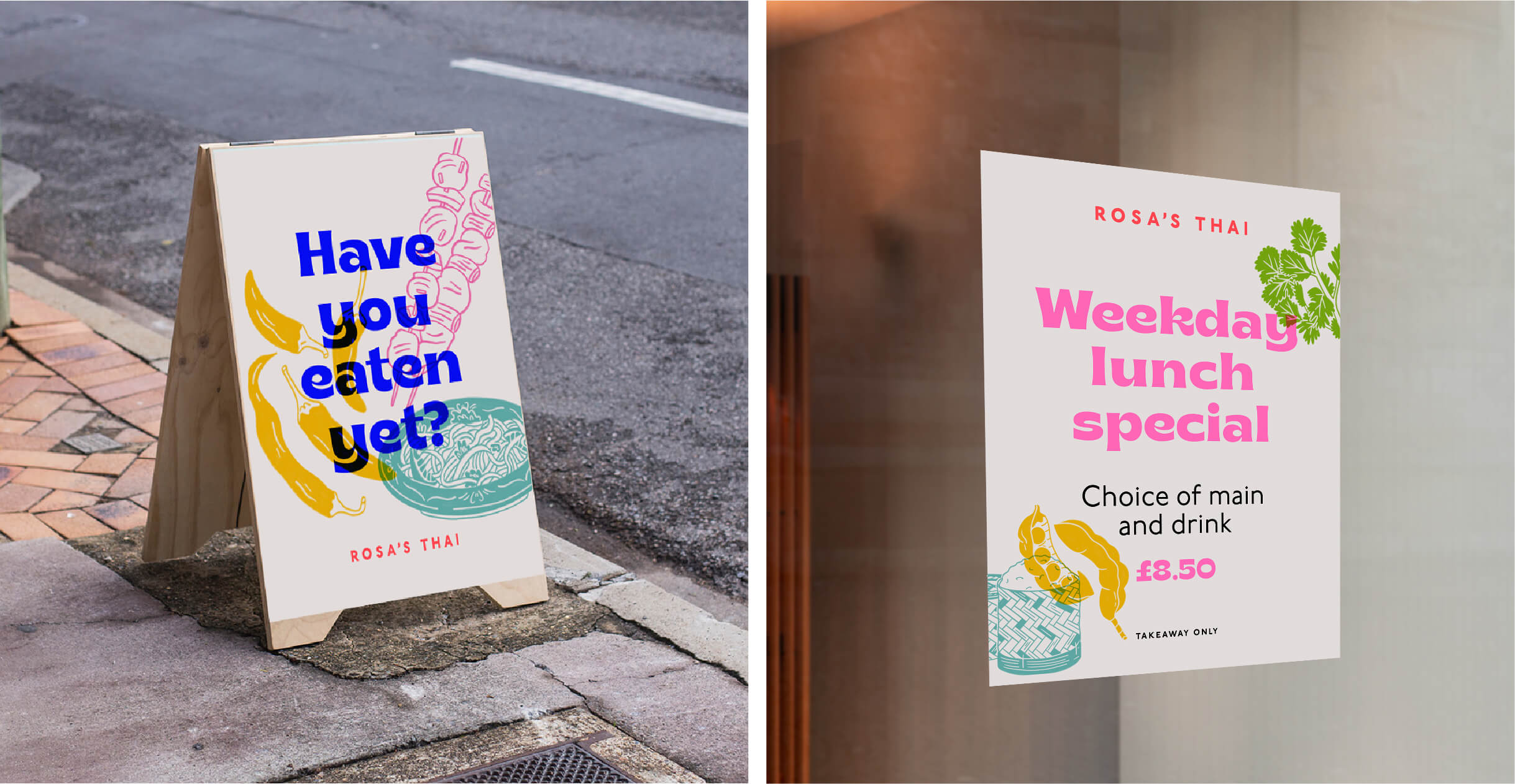
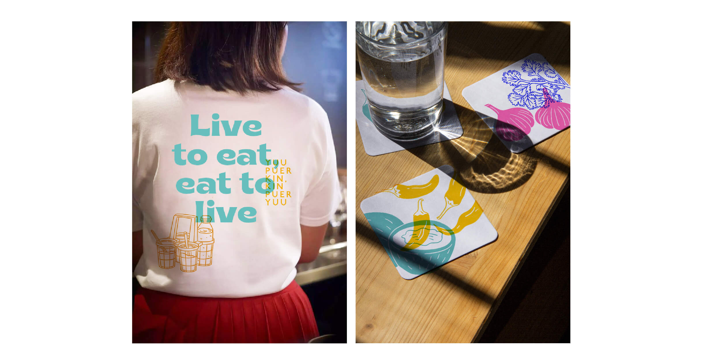
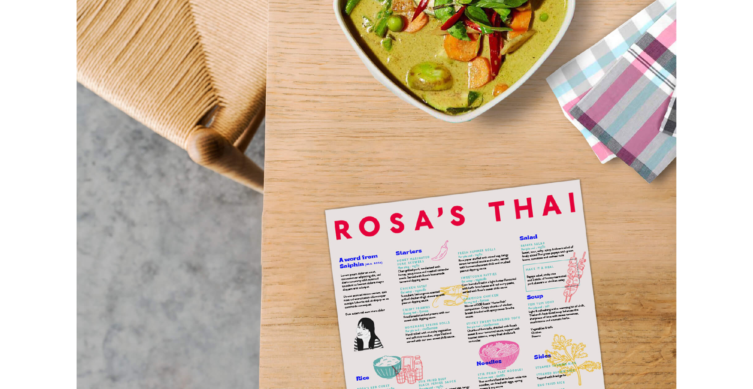
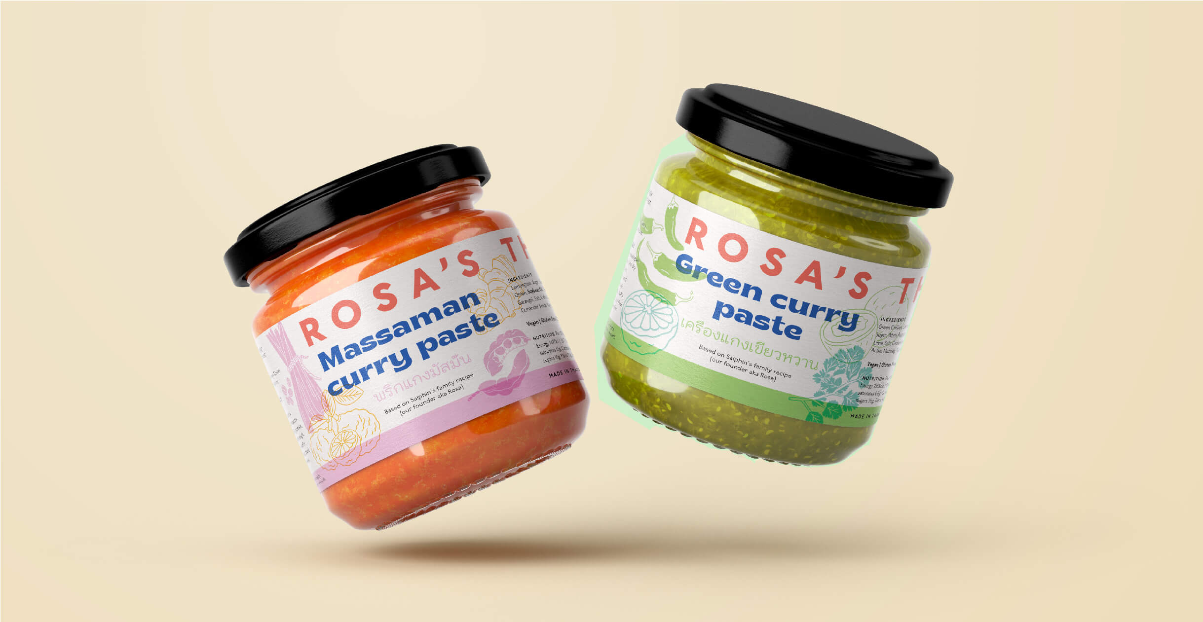
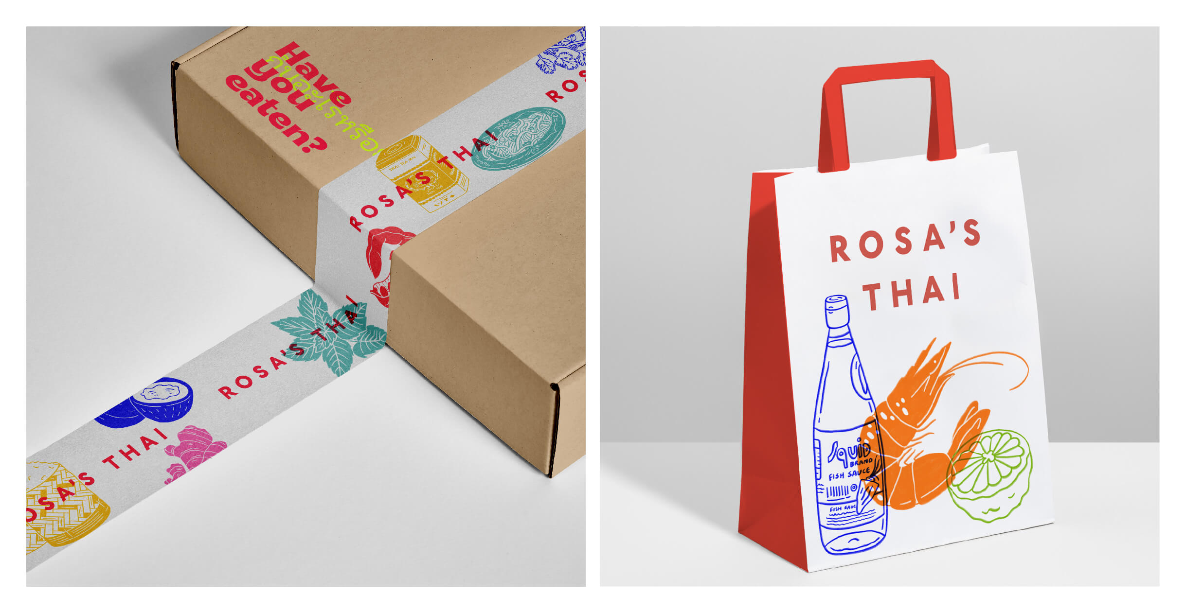
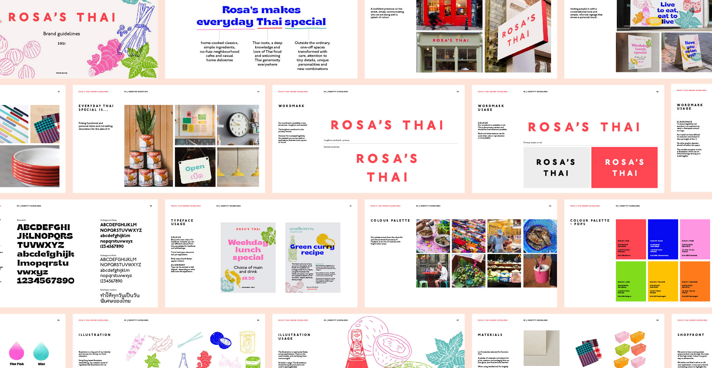
Collaborating with Thai creatives in an ideation session we got to the crux of how we could make everyday Thai special. Common Thai phrases were brought to the forefront emphasising a passion for authentic food and welcoming Thai hospitality. The colour palette was inspired by the vibrant street food scene and a new typeface was introduced with hints to Thai script. Ingredients were also championed in a set of food illustrations that were to be risoprinted to get a pure depth of colour and a handcrafted feel.
ROLE: Sole designer and design lead at Something More Near
